Architecture of Social Engagement, School, Bangladesh
August 23, 2012
When one comes across the words Bangladesh and architecture, the image of monumental Louis Kahn’s building in Dacca immediately comes to mind. This little school by Anna Heringer of Austria and Eike Roswag of Germany which received the Aga Khan Award of Architecture in 2007 may not be able to reach such heights of poetic monumentality but may be able to impart a much richer legacy for the well-being of millions. The school was considered a model for future development of high design quality achieved with traditional local materials like bamboo, mud and even fabrics for Saris with the involvement of the community.
These words from the Jury of The Aga Khan Award for Architecture are worth quoting.
“This joyous and elegant two-storey primary school in rural Bangladesh
has emerged from a deep understanding of local materials and a
heart-felt connection to the local community. Its innovation lies in
the adaptation of traditional methods and materials of construction to
create light-filled celebratory spaces as well as informal spaces for
children. Earthbound materials such as loam and straw are combined
with lighter elements like bamboo sticks and nylon lashing to shape a
built form that addresses sustainability in construction in an
exemplary manner. The design solution may not be replicable in other
parts of the Islamic world, as local conditions vary, but the approach
– which allows new design solutions to emerge from an in-depth
knowledge of the local context and ways of building – clearly provides
a fresh and hopeful model for sustainable building globally. The final
result of this heroic volunteer effort is a building that creates
beautiful, meaningful and humane collective spaces for learning, so
enriching the lives of the children it serves.”
The architects describe the two- storey structure as being ‘hand-made by local craftsmen, pupils and teachers together with a European team of Architects, craftsmen and students.’
The ground floor is made of thick mud walls, with organically shaped cave-like spaces to the rear of each of three classrooms, while the upper floor is a porous, latticed space in bamboo.
The aim of the school project was to improve existing building techniques, maintaining sustainability by utilising local potential and strengthening regional identity. The architects note: ‘We are convinced that architecture means more than just satisfying a need for shelter, For us architecture and building is closely linked with the creation of identity and self-confidence. This is the basis for sustainable and forward-looking development.’
An excellent link from MoMa for this project
http://www.moma.org/interactives/exhibitions/2010/smallscalebigchange/projects/meti_handmade_school
The contents and photos are attributed to AD of November/December 2007,with the title “Made in India”
Durham Students Union and Arup’s Bridge
December 15, 2011
One of the most sensitive and cleverly designed structures of recent times, Kingsgate Bridge by Ove Arup was built in early 60s and was soon joined by a notable neighbouring building, Dunelm House where Ove Arup Associates also acted as structural engineers.
The simplicity and delicacy of the bridge design is seen next to a large but broken concrete ‘jumble’ sitting on a steep slope almost opposite Durham Cathedral. I have been a great admirer of this contrasting ‘duo’ from the day I saw these in mid 60s and my recent second visit has not disappointed me in any way.
The bridge links Dunelm House to other university buildings across the river, while serving various buildings spread around it all over the city. The design exploited the sloping site to its advantage by hiding a large building complex with some large volumes without breaking the existing medieval texture of Durham.
The views from communal and other windows looking over the river and indeed the bridge offer superb views. The reflections of lights and life within the building seen from the opposite bank are also quite exciting.
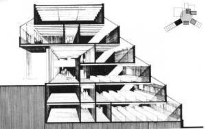
The building plan is conceived by forming a spine of stair route which collects the visitors at two upper most levels and starts their downward journey on this spine.
All major usable spaces are at various landings along the route. The stair widths and landings reflect the significance of destinations. The stair stops at the lowest level which also houses the largest and less frequently used main gathering space.
The original finishes inside the building were restrained and sombre. The grey concrete and quarry tiled floors were used in most places. The current taste and more affluent student population seeks more Pub/Club like atmosphere.
I am certain that such demands have resulted in use of some bright colours in main stair areas, destroying the unifying and linking function to move between various destinations. The yellowish tinge you see on my photos is result of paint and not the tungsten light or underexposure.
The original white open ceiling white planks with dark sound absorbent filling behind has now become shiny red which one is happy to accept as transient response to cater the tastes of given periods.
The external walls are made of lightweight (foamed slag) concrete fairfaced board marked finish both inside and outside of insulated load bearing external walls. It is remarkable to notice that concrete on Arup’s bridge has suffered heavy staining while Dunelm House is quite free from serious staining. This may be due to some property of the slag and its mix.
The original roof was meant to be covered in Zinc for economy reason, but Royal Fine Art Commission objected and the resulting precast giant concrete tiles were used using a pink shap granite.
This was obviously a step to ensure that the visible roof was part of this cohesive massing and fitted in the townscape more successfully.
The main entrances at the highest point of site at the junction of footpath leading to Arup’s bridge is brilliant design. These entrances bring the users to the head of stairs, feeding them down like a constant ‘waterfall’.
 Black & White photos from AJ 15 June 1966 and two other B&W photos and Blue Cross Section from Architectural Review (date not visible) from John Donat’s article.
Cedric Price, Influential architect and theoritician.
December 5, 2011
Archigram is well known and its influences on architectural world are clearly understood and illustrated. The name of Cedric Price (1934-2003) is often heard in Archigram circles as he was close to the group and took active part in discussions and even contributed but was never a formal member.
He was born in Potteries his father was an architect who specialised in Art Deco Cinema design. Cedric Price was trained at Cambridge and AA where he also taught influencing many architects, Richard Rogers, Rem Koolhaas, Will Alsop to name a few. He also worked for Maxwell Fry & Denys Lasdun before setting his own practice to build Aviary for London Zoo. He built very little but like many other thinkers had tremendous influence on future direction of architecture which continues to this day.
He was a believer in “calculated uncertainty” where adaptable, temporary structures were preferred. He believed that an ‘anticipatory architect’ should give people the freedom to control to shape their own environments. All buildings according to him should allow for obsolescence and complete change of use. Will Alsop, who worked for him in early 70s recalls CP’s delight in designing a Cafe for Blackpool Zoo which was eventually to be turned into a giraffe home. This fitted perfectly into his themes of uncertainty, adaptability and change.
In his ‘Thinkbelt’ University project he proposed simple, moveable buildings which would deliver education “with the same lack of peculiarity as the supply of drinking water.”
His most influential project was ‘Fun Palace (1961) ‘ for Joan Littlewood. It was killed off by local government bureaucracy. The design of Richard Rogers and Renzo Piano’s Pompidou Centre in Paris is called a direct descendant. Soon after that he designed ‘ Potteries Thinkbelt (1964)’ which still makes great deal of sense. Among his built projects only Aviary in London Zoo remains, as he ensured that the other temporary structure for a community use ‘Inter-Action Centre’ in Kentish Town was not listed but demolished as intended. It is also amusing to recall that he was the only architect who was a fully paid-up member of ‘Britain’s National Institute of Demolition Contractors’.
“Aviary was designed for a community of birds and his idea was that once the community was
established it would be possible to remove the netting . The skin was a temporary feature: it only needed to be there long enough for the birds to begin to feel at home and after that they would not leave anyway. ………Price the theoritician, functionalist was frightened of and avoided style. …. he wasn’t interested in being remebered. He was building a memory.” 1*
Later in his life he worked on ‘Magnet City’ which was an exercise in using intermediary spaces in London urban landscape to stimulate new patterns and situations for urban movement in the city. shown in an exhibition in 1997.
He also contributed to the ‘Non-Plan’ debate with Paul Baker and Peter Hall. This basically was an ‘anti-planning polemic’ which resulted in the formation of ‘enterprise zones’ like Canary Wharf in London and ‘Metroland’ in Gateshead. On personal level I never came to see great sense in this reaction against the previous planning failures and put in their this ‘free for all’ American style money making system even if it generated big business and attracted lots of users.
1* Will Alsop’s recollections.
Photo above shows three views (interior & exterior) of Fun Palace by Cedric Price 1962.
Smithsons’ buildings for University of Bath II
July 10, 2011
The School of Architecture and Building Engineering (E6)
What is ‘Conglomerate ordering”
To understand the most significant building by Smithsons on the campus, the school of Architecture and Building Engineering or E6, one must try to comprehend the ideas behind ‘Conglomerate ordering’ which emerged in Sienna period of ILAUD.http://en.wikipedia.org/wiki/Ilaud This building demonstrates many of these ideas and twenty years of use have also thrown some light on Smithsons hopes and expectations.
Following summary is abstracted from AJ 30 November 1988
1CO.* ‘ A building of conglomerate ordering is hard to retain in mind… it is elusive except when one is actually there; then it is perfectly lucid.
2CO. ‘It brings all our senses into play through the widest possible differences: fear and pleasure mixed together.
3CO. ‘The building has a thick building-mass; (as La Granccia di Cuna and Santa Maria della Scala) not very high…penetrated from the top for light and air.
4CO. ‘The roof of a building is another face …all faces are of equal value, all equally considered, but non are “elevations”.
5CO. Conglomerate buildings are an inextricable part of larger fabric .It has no back, no front; it is equally engaged with all it confronts. A change within its “convention of use” enhances its sense of order.
6CO. Its fabric can accept interventions.
7CO. It is dominated by one material… the conglomerate’s matrix.
8CO. It seems to be pulled-down to meet the ground, not the ground built-up to meet the building.
9CO. It is lumpish in weight and has weight.
10CO. Its bearing walls and columns diminish in thickness as their load or need for mass diminishes; walls and column spacing is irregular, responding to use and natural placing.
11CO. It has a variable density plan and a variable density section.
*The numerical referencing above does not represent any order of importance and simply being used to refer to my descriptions/observations regarding this building.
E6
I consider the location and design of this entrance building as pivotal for the campus. Not only it was to act as a ‘sign post’ for entrance but it was to perform the task of moving thousand of students and staff from ground level to main raised deck and down again. It was built well after completion of 60’s campus development, indeed almost at the end of the productive life of the architects, who were also going to show their final hand to test and explain ‘Conglomerate ordering’ among other thoughts.
The best way to share my views of this long awaited visit is to understand and explain architects intentions and then try to share the buildings in their present context. The wear and tear caused by the general use and age and any changes due to change of functions can then be highlighted. I am afraid some effort is required on our part to understand the architectural process used by Smithsons which produced a small body of disparate work of undisputed architectural significance.
Let us start by describing the impact of arriving at the campus for a first time visitor who has just parked the car in nearby visitors’ car park. The positioning of a large bus stop/vehicle turning place with bus shelters around it and pedestrian friendly surfaces, surrounding landscaping and buildings announce that this is more than a bus stop and makes you register it almost like a town square.
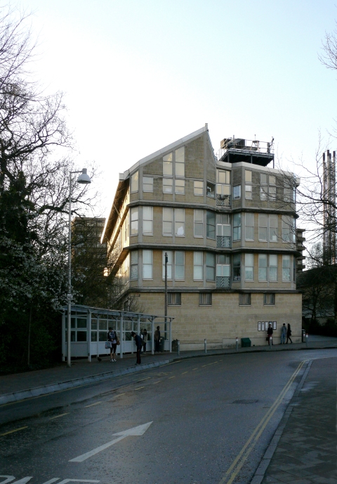
This feeling of arrival is reinforced by the presence of a slightly odd end of a longish slab building which is welded to this ‘arrival space’ near one edge at a slight angle as though it is trying to envelope the ‘space’ just described.
Since you have no clue as how to enter this huge complex of buildings, your eyes run past the end of the ‘odd’ building and there is no doubt in your mind that a major route is being announced by presence of very wide steps attached to this building looking straight at you. This invitation (with an Italian accent) is irresistible and without any hesitation you undertake this journey of discovery.
Oscar Niemeyer’s sketch from his 2003 Serpentine Gallery Pavilion is for me the best analogy I can offer (with the sincerest apologies to Smithsons but possibly delight of Neiymer). Can you imagine asking some student at the bus stop for directions to get to Architects Department and getting a reply “Go up to the knee and turn left, but don’t take the lower path” or “Library? ah! go right up to the belly button and turn right”.
The wide steps are arranged some distance apart at different angles hugging the side of the long building. You notice the steps reduce in width as you climb and you also gradually find yourself under the cover of upper construction of this building. You are also aware of obstacles like balustrades and local ramps near doors trying to impede your upward journey.
If you happen to look into the building through the windows on left, you are bound to notice large display of architectural photographs fixed to a corridor wall running parallel to the route you are following. Some entrance doors to this corridor and signs indicate that these doors take you to the School of Architecture. If you look to your right and backwards you would have gained enough height to see distant campus building and the country side.
After a fairly long walk but gentle ascent, these steps bring you to a very large platform on the right. This space has trees and is surrounded by lots of high building on each side and bridging overhead. The ‘odd’ concrete building with attached steps which offered cover to this route has now attached itself to one of the older arcaded buildings around this raised area, and you are still walking in an older arcade.
(The width of Smithson steps was predetermined by an existing arcade of the same width to which these originally connected to, well before the upper deck was reached. This in not the case any more, as the deck has been extended towards E6 to meet it and a new lift has been located here basically to for disabled users. This act of arrival via steps of fairly restricted width to a very wide platform originally was a puzzle to me as there was no apparent reason for not finding a more generous stepped ramped approach. Another set of stairs has been added to the other side of the road as well (second of Oscar Niemeyer’s sketch legs).
Having reached your destination, like any sensible architect, you retrace you steps and experience the journey backwards and explore the other side of this ‘oddity’ of a building. This is an entirely different world. A great deal of raw building materials and machinery paraphernalia dominates the back yard; you obviously are in the Building Engineering department of the campus. This area has its own vehicular access and much more formalized disposition of windows responding to other surrounding buildings. There is also a bit of playing with forms (God forbid!) as the back of lecture theatre shows its presence by two chamfered walls expressed on external elevation.
When you see the end of the building facing the ‘square’ carefully, it becomes apparent that this also acts as a cross section explaining the assembly of the constituent parts (corridors, roof lights, Workshops supporting studios, roof platform for daylight studies for school of architecture).
There are two doors linking School of Architecture to the grand staircase at slightly different levels and in turn connected with another local circulation passage running parallel to the main stepped route offering views in and out and also offering on display some architectural activities and serving a generous crit room also acting as a lecture space. Two stairs and a lift also connects the entrance level to serve most of studios, seminar and workrooms on two floors above and access to the ground level below.
A walk in the school of architecture soon reveals that there is a great shortage of social and informal meeting spaces throughout the building. The circulation spaces are too restricted to offer any other meaningful activity. I assume it is a direct result of financial straitjacket architects found themselves in dealing all the work on this campus.
A quick look at the list of ‘conglomerate ordering’ (with numerical references above) reveals that Smithsons have managed to achieve most of their aims.
1CO- I can verify that building is hard to retain in mind as despite my best efforts to recall what I saw internally, I was unable to draw a plan with any certainty.
2CO- matter of all senses I am afraid is difficult to comment on. Fear and pleasure are strong words. The daylight quality in studios and views are pleasurable and nice.
3CO- Building has thick mass and lit from the top indeed.
4CO- All faces, including the roof are well considered and are of equal value.
5CO- The building equally engaged with all it confronts. Some major changes within the building have already successfully taken place without any change to sense of order.
6CO- Fabric is continuing to receive interventions and thriving. For examples most of the studios are new interconnected with new openings and various walls have been added or altered.
7CO- The use of Bath stone and concrete frame remains the conglomerate’s matrix and weathering well. Horizontal banding of concrete is even more pronounced because of lichen growth on it.
8CO-The grand staircase literally pulls the building to ground. The walk on grand staircase offers interesting little incidents but does not make any attempts to perform visual gymnastics which have become the hallmark of new generation of architects. The real contribution lies in linking one newly created space to an existing one, without trying to dominate any but keeping the interests alive throughout this transition of height.
9CO-Building is lumpish and has weight.
10CO-Walls and columns respond to load and reduce where possible. Columns are irregularly placed for many areas responding to use.
11CO- It has a variable density plan and section.
When the building opened all of the School of Architecture could not be accommodated here but now it is all under this stainless steel roof and looks very happily settled as one can gather from the usual assuring clutter of models drawings and odd furniture in well lived in studios.
The exposed services originally were considered crude but constant changes have proved that this was the right decision. The building must have absorbed many changes to services particularly in relation to new IT changing needs. It appears that the results are more than satisfactory and continue the original relaxed looking distribution without any known failure of crops of young architects coming out of this school with phobias about exposed services. I have no doubt that this building would remain a fitting tribute to the architects who chose to close their architectural account with this. It may take some time but I am sure it will mature like a good wine.
All old B&W photos, plans and various absracts taken from AJ of 30November1988.
Smithsons’ buidings for University of Bath
July 6, 2011
Smithsons have earned themselves a very special place in 20th century British architectural world to sit on a high ledge and look back at their lifelong work consisting of some seminal buildings, influential and extensive writings and indeed some heartbreaking disappointments which almost drove them to despair.
Their final projects were built at Bath University campus which was founded in 1965 as a college of Advanced Technology based on a master plan by RMJM. I recently visited the campus for the first time to see Smithsons projects which are not very well known here as these were designed by them towards the end of their lives after a long and painful ‘drought’ of work. The architectural landscape of early 80s in Britain had changed and was dominated by new ‘superstars’ producing visually exciting stuff. The younger generation being taught by Smithsons failed to notice the pedigree and place of their new work in recent historical context being built around them. In fact, by this time most of the architectural world was not interested or impressed by what little they noticed in the press. Smithsons as usual were not to be swayed by the current fashions and in their normal defiant manner they took up the challenge to put their architectural legacy in rightful historical context with this last chapter they wrote and edited themselves.
Unfortunately, their good luck in obtaining this work in 80s coincided with another ‘drought’, this time financial, which almost decimated any attempt to produce buildings of decent standards to go with the growth demands of the campuses completed in the heady days of 60s. These campuses reflected the social and technological optimism of high hopes experienced by that period. The financial restrictions faced by Smithsons were bad enough but their insistence to ensure that their contributions were in keeping with their earlier intellectual aims made their life even more difficult. Although most of the ideas behind the master plan were derived from Smithsons/TeamX work but I feel that they were not entirely satisfied with this development as they clearly stated that they wanted to ‘…extend them and delicately shift their meaning.’
For Smithsons this opportunity to build meant “Almost a series of case studies. Each building could be a demonstration of different attitudes to location siting, and construction. Each could also show in built form both the development of formal, organisational or constructional ideas which had previously only existed in drawings for earlier projects, and the emergence of new thoughts related to the adaptation and extension of the fabric of existing settlements.” (From AJ article)
The Second Arts Building.
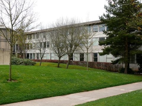
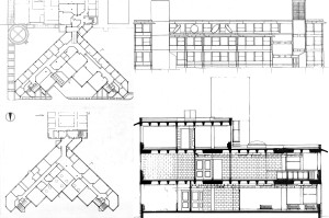
The second Arts Building was described by the architects as a new piece woven onto the edge of an existing mat… like a terminating fringe …seemingly complete. It is three storeys high and delta shaped in plan. A ‘knuckle’ lobby links this building to the older building next to a staircase. Three different departments were housed on different levels and the room functions were allocated according to type of occupancy, need of looking out, need for darkness and thermal requirements.
A Zumthor like feature has emerged where Smithsons wanted ‘internal ways’, (corridors to you and me) to have an exposed blockwork finish which had a carefully calculated acoustic quality – ‘the noise of one’s feet getting quieter as one penetrated the building’. This plan was foiled as the university proceeded to plaster these surfaces, which architects described as an occupational hazard.
The plan is attempting to create triangular landscaped courtyards which Smithsons were hoping to be full of mature landscaping after 20 years or so.
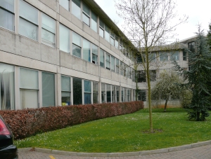
The most striking visual feature is the cornice described by Smithsons as ‘ a Moghul style chujja’ which ‘acts like the wide brimmed traditional English ladies’ garden party hat, its wide brim extending a protective field around its wearer yet making the eyes seem larger… it has an effect both of distancing and tempting.’
Smithsons used a similar analogy by calling the timber trelliced work at St Hilda as a kind of ‘yashmack’ offering some protection to the female occupiers of the bedrooms.
While the outer edges of tassels forming the triangular courtyards are straight with ribbon windows and v-joints in concrete surfaces (Smithsons first venture in exposed poured concrete) leading to a language of external surface grooves, the north facing face in between these edges has a zig-zag edge which is firmly held between two stairwell towers rising high to contain air-handling plants at either end.
This orientation of the building is also an attempt to make the back of building look more animated and less of a ‘back’ of ‘centrally focused mat’.
I also feel that Smithsons are referring to Lasdun’s student clusters of East Anglia. This is one of the very few British examples of modern architecture mentioned in their book ‘Without rhetoric- An architectural aesthetic’. They have very cleverly reversed the massing and orientation of Lasdun’s
ziggurats to achieve the architectural shift they sought. I was not able to go in Arts building, or talk to any occupier and therefore am unable to comment about the functional aspects. Unfortunately, the overall appearance of the building, massing and now fairly matured landscaping are not offensive in any way still leaves the architectural anticipations and emotions ‘thirsty’ from such great names.
Non-academic staff building
This building is located on the south side of the main campus in a two storey high detached pavilion. One can see similarities with their famous1960s Upper Lawn Pavilion at Fonthill. The upper floor here looks in three directions and sits on a partly submerged heavily constructed ground floor. I am unable to find out whether this base was some existing structure or created by Smithson themselves. There is a very definite back/service side to this construction but other three sides and indeed the roof have been designed to deter any future additions to the structure. It is meant to be a defined punctuation mark not there to be meddled with in future. All this is perfectly understandable for a building to be seen and used by users approaching this key location from all parts of the campus also ensuring the edges of the ‘mat’ are suitably terminated.
The light weight steel construction of upper floor relies on heavy cross bracings on corner and a substantially heavy concrete fascia beam has been attached to light weight steel sections for support. The recessed voids on semi-sunken lower level remain function-less and are still cause for concern to the university and were recently fenced off.
The concrete fascia may be attempting to relate to the existing vocabulary of older campus buildings but it is worth remembering that the Arts Barn on the other side of the campus has also got a steel roof and fascias both covered with stainless steel skins.
However, the limited availability of funding an inherently expansive and space wasting semi-submerged resting base for a bridged access ‘piano-nobile’ and attached terraces may have produced an adequately functional building, but I am beginning to develop some inferiority complexes about my own ability to appreciate some hidden qualities of these two great architects who possibly are too cerebral for me to follow as I have to admit this building leaves me bereft of any architectural emotions resembling joy or pleasure.
The following issues of AJ were used for References, plans, photos and quotations; AJ 30 November 1983. AJ 16 January 1991.
John Andrews Brutalist Megastructure in Toronto
November 27, 2009
One of the best examples of 60’s brutalist monolith structures is a sizeable and well considered building designed for a dramatic site in cold climate. Since a significant slice was built as the first phase by a confident and dedicated architect, the functionality of the building can be assessed to measure various design criteria envisaged by John Andrews.
Unfortunately, the Canadians seem to be shy or ashamed of this significant building and the younger generations of architects seem to be unaware of this example of romantic brutalism, representing a significant branch of modern movement in mid 20th century.
I visited Canada as an architectural student to see Expo 67 and also took this opportunity to see as much architecture on East coast of Canada and USA I could cope on the Greyhound buses. Scarborough College, as it was known then, completely bowled me over. Even my semi-matured architectural understanding could not fail to grasp the ‘magic’ of this building. Luckily the slides I took, survived more than 40 years of storage and a bit of cleaning of digitised images is the basis of my photographs here and on Flickr pages. Set http://www.flickr.com/photos/iqbalaalam/sets/72157603763663802/
Kenneth Frampton wrote a critique of this building in April 1967 issue of Architectural Design. I am reproducing some of the drawings from this article and paraphrasing or quoting some other relevant parts.
Scarborough was designed as one of the first two satellite campuses to take all their undergraduate programmes. As it was a fair distance away from Toronto, the students were to gain access by car or bus. Kenneth Frampton was surprised to see lack of undercover walks from distant car parking to a building which entirely relied on warm covered student circulation. He assumed that this was either a cost saving measure or possibly certain architectural preconceptions about approach and entry to the building. Andrews wanted the open academic near the admin block to be a dignified, formal hub of the college activity giving access to all college buildings.
The layout is centralized in its organization. The positioning of radiating wings of the building was governed by the site constraints and maximum walking distance of 10 minutes.
“The choice of site has ruthlessly determined the plan profile of the building, making it an obsessive and rock-like extension of the escarpment upon which it rests. The old classic imperative that man-made form be rendered distinct from natural form is at once challenged by this organic parti.”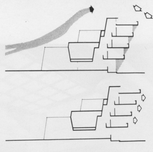
KF considers the building to be a biological organization on an irregular site, difficult to handle formally. Receding or cantilevered wings modulated, when possible, by structural or servicing elements as well as cranked ‘knuckles’ containing lecture halls, changing the direction of wing segments. The entire building is thus ‘coded’ externally to express consistently four different component functions: lecture halls, offices, laboratories and staircases.
The projecting or receding elements also help to form continuous enclosed pedestrian streets rising two floors or full height of the building. The inclined service ducts serving laboratories not only feed and drain waste from the laboratories but also distribute forced air to and from ducts on the roof.
 In the humanities wing a two-tiered counterpointed battery of lecture halls maintains a protective windowless wall on northern windswept face, while the faculty offices on south face project out providing solar protection.
Tiered sections also provide daylight to internal streets and full height court, ‘meeting place’ placed at the meeting of two converging streets.
“One cannot but be impressed by the ingenuity and generosity of this organization and by its evident operational success. It is a success that is ‘environmentally’ supported by the consistent use of high quality internal finishes and by felicitous light.”
Scarborough possesses a built-in allowance for variable patterns of use…..
As Oscar Newman has observed, ‘The continuous problem of change can to some extent be avoided by the further development of the organic logic and hierarchical organization of spaces and activities—a solution which in itself goes a long way toward limiting the need for large-scale future changes.’
“Scarborough departs radically from the traditional Anglo-Saxon quadrangular university complexes of recent years. It is by far the most daring, comprehensive and radical, and as such merits serious critical attention.”
Towards the end KF writes in some detail about the intellectual aspects of campuses as prototypical city form and compares Scarborough with work of Candilis, Josic and Woods. He considers limits of growth, organization and classic vs. romantic thoughts. I suggest you read the article to read this analysis.
The article ends by stating, “Scarborough belongs to the nexus of thought… shaped by Camillo Sitte ….and travels to Frank Lloyd Wright….. and back in Europe is to be found in the thoughts of an Aalto, a Pietila. It is equally the thought of a James Stirling or a Paul Rudolph. These men are all positively not of the classic mind – and neither is John Andrews.”
After 40 years of expansion and changes, the latest master plan can be seen here http://www.daniels.utoronto.ca/node/753.
When John Andrews was designing and building this in Canada Denys Lasdun was in the middle of constructing University of East Anglia which has many similarities with Scarborough. While Patrick Hodgkinson conceived Brunswick Centre in London almost at the same time as Scarborough was being designed, although it was not completed till 1973. It has a much more urban and slightly formal context as one of the best megastructures of the period in this country.
More photos of this project and other Andrews work on my Flickr set http://www.flickr.com/photos/iqbalaalam/sets/72157603763663802/
For recent photographs see set from Ben http://www.flickr.com/photos/bencnh/sets/72157624082032257/
Birth and death of Newport High School 1972-2008.
September 9, 2009
Newport Comprehensive School Competition was won by Eldred Evans and David Shalev in 1968, Foster Associates, Brian Frost and Douglas Stephen & Partners were among the finalists. James Stirling was one of the judges.
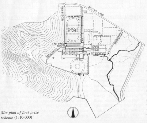
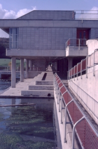
Extracts from winners report said that the building is organized around the house system in three tiers; lower school to the south; middle school; specialist teaching block and subject rooms to the north, running parallel to both. The halls and library/sixth form complexes terminate the system to east and west respectively.
The circulation was arranged in a gridiron pattern of movement throughout the school on two levels-covered and open walkways.
Covered east/west routes link all houses to one another and end in the library/hall complexes.
Covered north/south routes are for more frequent daily movements of pupils from bus dropping point to houses from form rooms to specialist teaching block. Open north/south route ends in outdoor teaching terraces.

There were ten houses: upper school 4; lower school l4; sixth form1; staff1.
Each consisted of three south facing, flexible teaching area, an activity room adjoining two of the form bases and house dining room, all arranged around a protected courtyard into which they could extend.
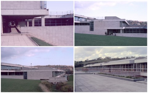
Although the house system was rigidly adhered to, architects considered that this would not inhibit different type of organization if required, as they thought that some form of identifiable grouping would always be required.
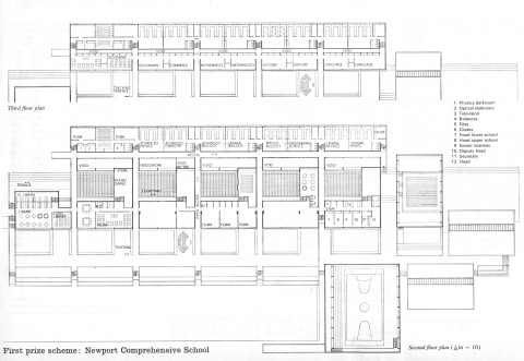
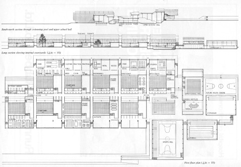
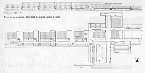
* Above extracts and competition entry drawings abstracted from AJ of 24th January 1968.
Unfortunately, all these built in flexibilities did nothing to save the school from poor maintenance and deterioration and eventual premature destruction. An unloved and neglected building was almost hurriedly driven to death.
It was sad to see intelligent educationalists themselves failing to see the folly they were committing by destroying this important building without any attempt to give it a new lease of life.
The organization, though much larger and complex, always reminded me of simplicity of Jacobson’s school at Munkegaardsl in Copenhagen (1952-56).
More photographs are available on Flickr http://www.flickr.com/photos/iqbalaalam/sets/72157604618949581/















 Coffee Hall grid (along with Netherfield and Bean Hill) was one of the earliest grids to be developed. The layout was a refined exercise in organizing a highly ordered and disciplined grid in and around existing landscape features. One and two storey terraced houses to Parker Morris standards were provided in fair faced concrete walls with flat roofs at fairly low housing densities.
 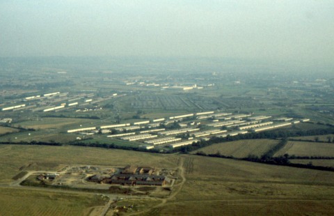 Coffee Hall never recovered from a disastrous start with a reputation of a failed estate in almost all aspects. The original housing saw some immediate changes to cure leaks and condensation and the empty spaces left un-built around the rigid geometric grid were soon filled in by badly designed housing, which I find too painful to photograph to this day.
 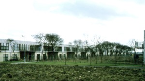 The housing was built to generous Parker Morris space standards but built during a shortage of reasonable building materials and tradesmen. Leaking roofs and condensation started to plague the estate right from the day one. Note the retention of existing hedges.
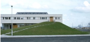
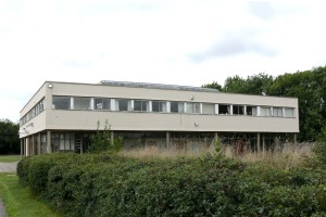 A loving tribute to Corbusier was offered by the MK architects but for obvious reasons Villas were not on offer. However a church was perfectly in order. Unfortunately even this little modest offering has suffered by thoughtless additions. This remains one of the few buildings worth a visit in this area. White paint is now cream and the grass mound has been replaced by an unsightly curved roof building.
 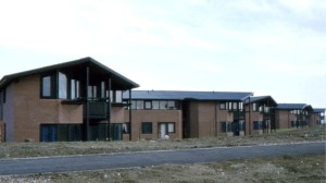 MacCormac & Jamieson produced this noteworthy housing for single people in 1975-77, when this slide was taken. Even in the present state of poor upkeep, the building sits on site comfortably and retains its poise to enhance a depressing area.
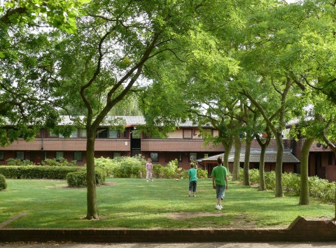
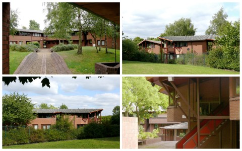
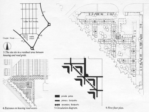
 The northern part of the grid was reserved and planned for Woughton Education Campus to house three secondary schools, a Roman Catholic school, school annexes, a sixth Form College and a joint use recreation centre. According to the Head teacher of the Campus,” Woughton ward is among the 10% most impoverished in the country and the catchment area is the most deprived in MK”
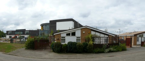
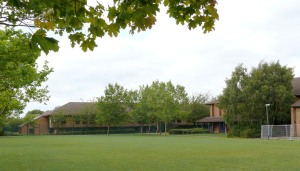 The odd juxtapositioning above illustrates a competition winning low cost private housing scheme by Andrew Sebire & Kit Allsop built in 1982 , described by them as architectural equivalent of the Citroen 2CV.
 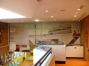 No one imagined that one day it will be pitched against the juggernaut of an Academy next door. The grassed area on left is surrounded by the school (1978) on one side,now to be demolished and Woughton Centre housing Sports Hall, Performance Area and Swimming Pool (shown on left) acting as a community building. There was some modest housing planned on opposite extremities of the education campus to create some mixed use, but the temptation to fill the empty green fields with housing (and once again of terrible layout and design)


